All work
Zelora & Enreal
Designing a consumer energy app and the white-label system behind it, for two brands and thousands of solar and battery owners.
Designing a consumer energy app and the white-label system behind it, for two brands and thousands of solar and battery owners.
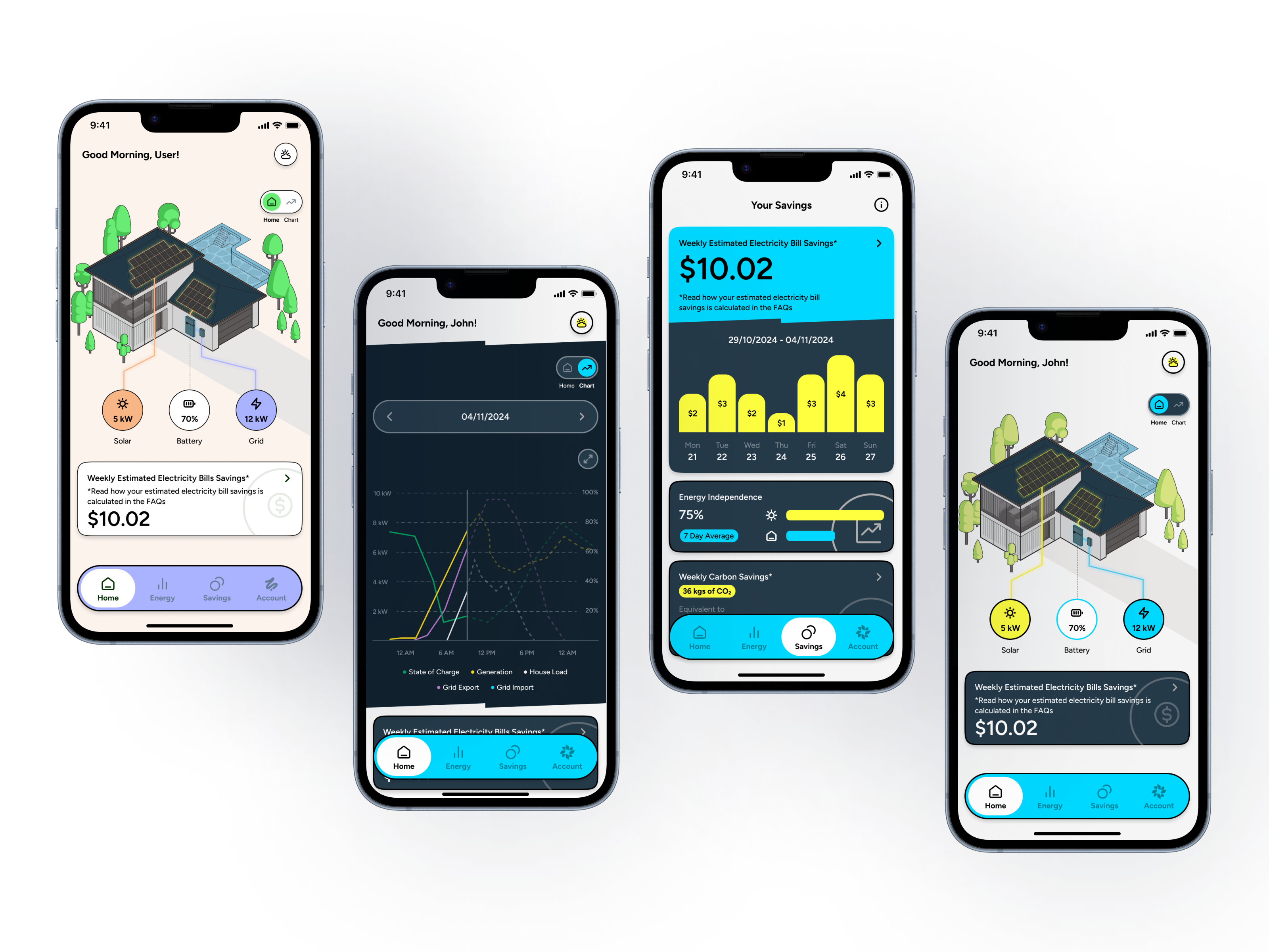
Zelora and Enreal are consumer-facing apps that give solar and battery owners visibility over their home energy — generation, consumption, export, and savings. Both products run on the same underlying platform. I was the sole product designer across both — responsible for research, information architecture, UX, visual design, and the white-label system that allows a single product to serve two distinct brands without rebuilding from scratch.
Zelora is a Bunnings-backed product for homeowners with rooftop solar and battery storage. Enreal serves home electrification customers — households transitioning away from gas to an all-electric home. The design brief was consistent across both: make complex, real-time energy data legible and motivating for everyday homeowners, not energy professionals.
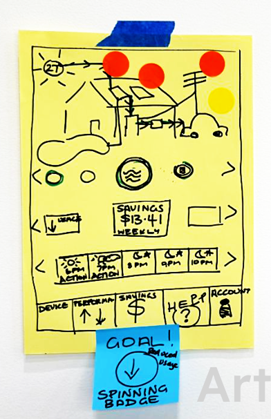
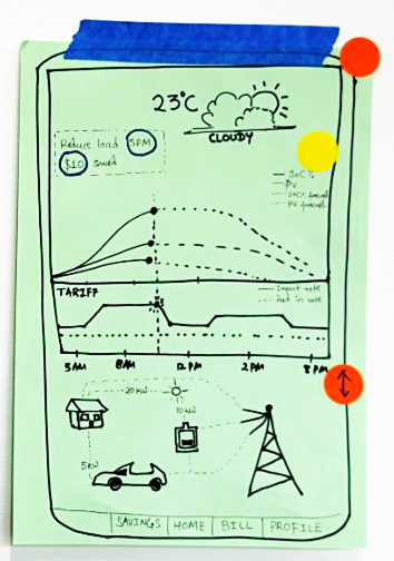
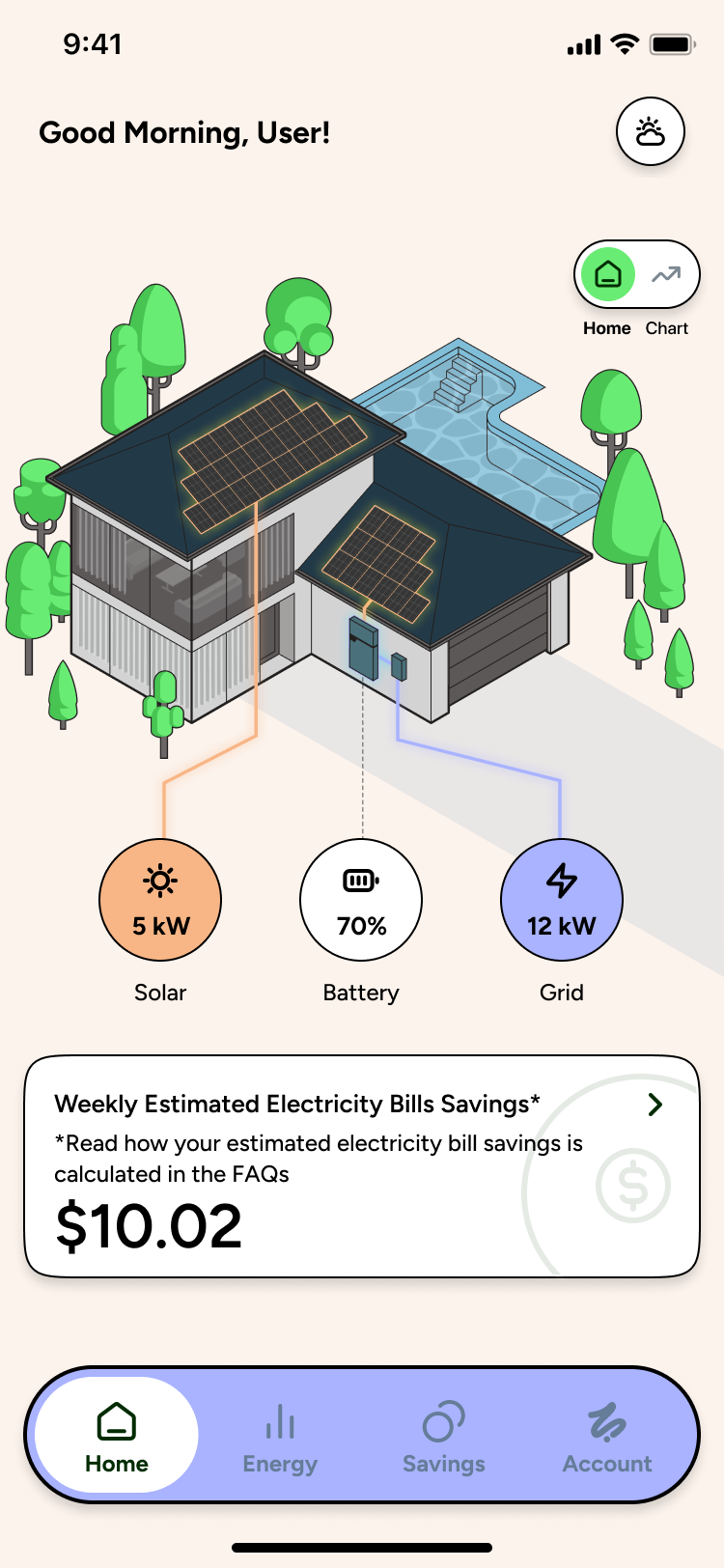
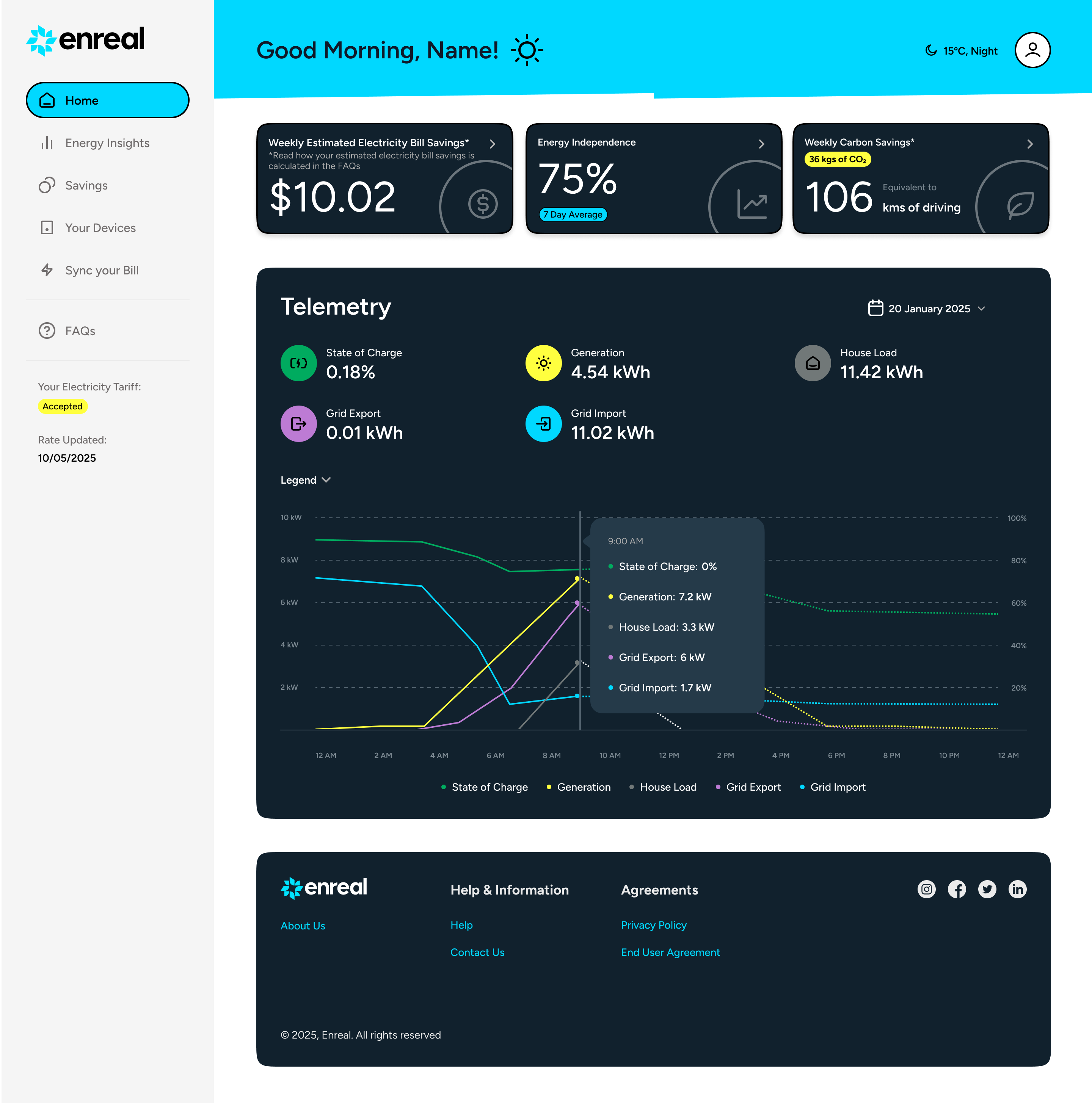
Early design sprint explorations used spider diagrams and radial data visualisations — technically accurate representations of energy flow, but ones that required interpretation to read. I anchored the home screen around a house graphic instead: a central metaphor that homeowners orient to immediately, with energy flows mapped to the familiar parts of their home rather than to abstract chart segments.
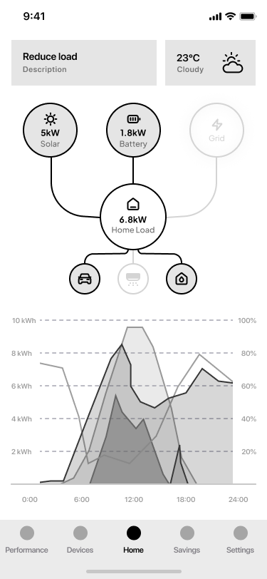
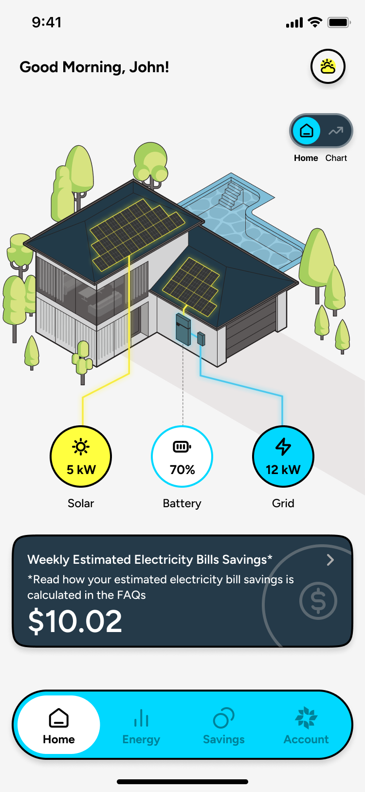
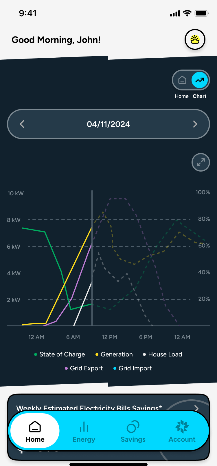
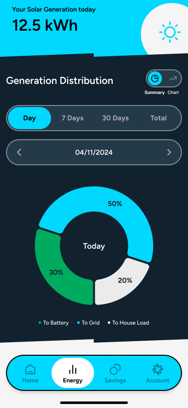
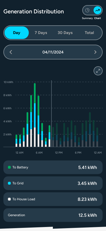
Research pointed to a clear split in how users engage with their energy data: most want a quick status check — is my solar generating, am I exporting to the grid, am I saving money? A smaller but active group wants to go much deeper into real-time flows and historical data. Rather than designing two separate interfaces or landing on one middle ground that served neither well, I introduced a toggle directly on the home screen. Users can switch between a simplified summary view and a detailed live chart view in one tap — the simple view is the default, the chart view is always accessible.
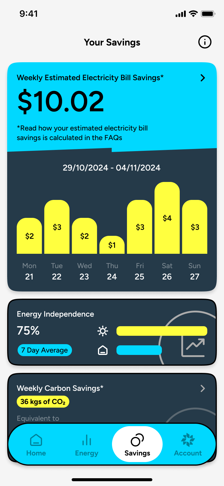
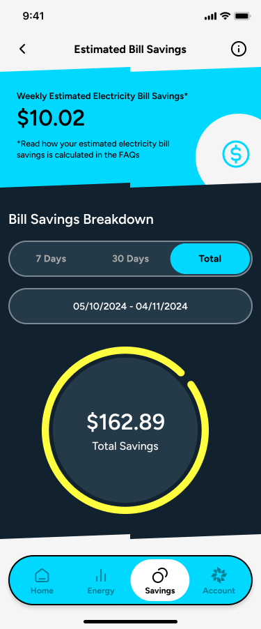
For homeowners who have spent $10,000–$20,000 on a solar and battery system, the most important question the app can answer is: is this paying off? I designed the savings experience to lead with financial return — bill savings, feed-in earnings, and avoided energy costs — broken down in the same language as an electricity bill, so users can directly compare what they see in the app to what arrives in their inbox.
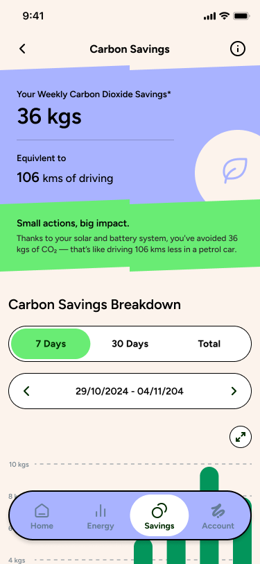
I chose a seven-day savings view over a single-day figure deliberately. One day of data is easily skewed by weather or an unusual usage spike; seven days gives users a realistic and honest picture of what their system is actually earning them, and builds confidence in the investment over time. Carbon savings are presented as a secondary layer — available for users who want to connect their financial return to a broader environmental impact.
Zelora and Enreal have distinct brand identities — Zelora's palette is warm and Bunnings-aligned; Enreal's is clean and teal. Designing for both from the outset, I treated brand as a variable from the start of the component system, not something applied after the fact. I structured the white-label architecture to separate brand tokens — colour, typography, logo — from layout and interaction logic, so a brand swap produces a coherent experience across every screen without touching the underlying structure. The same approach extended to feature architecture: I built components and flows to be added to, so the team could continue shipping new features without reworking the foundation.
A walkthrough of the Zelora app showing the core energy dashboard, simple and complex view modes, and the savings experience across a live account.
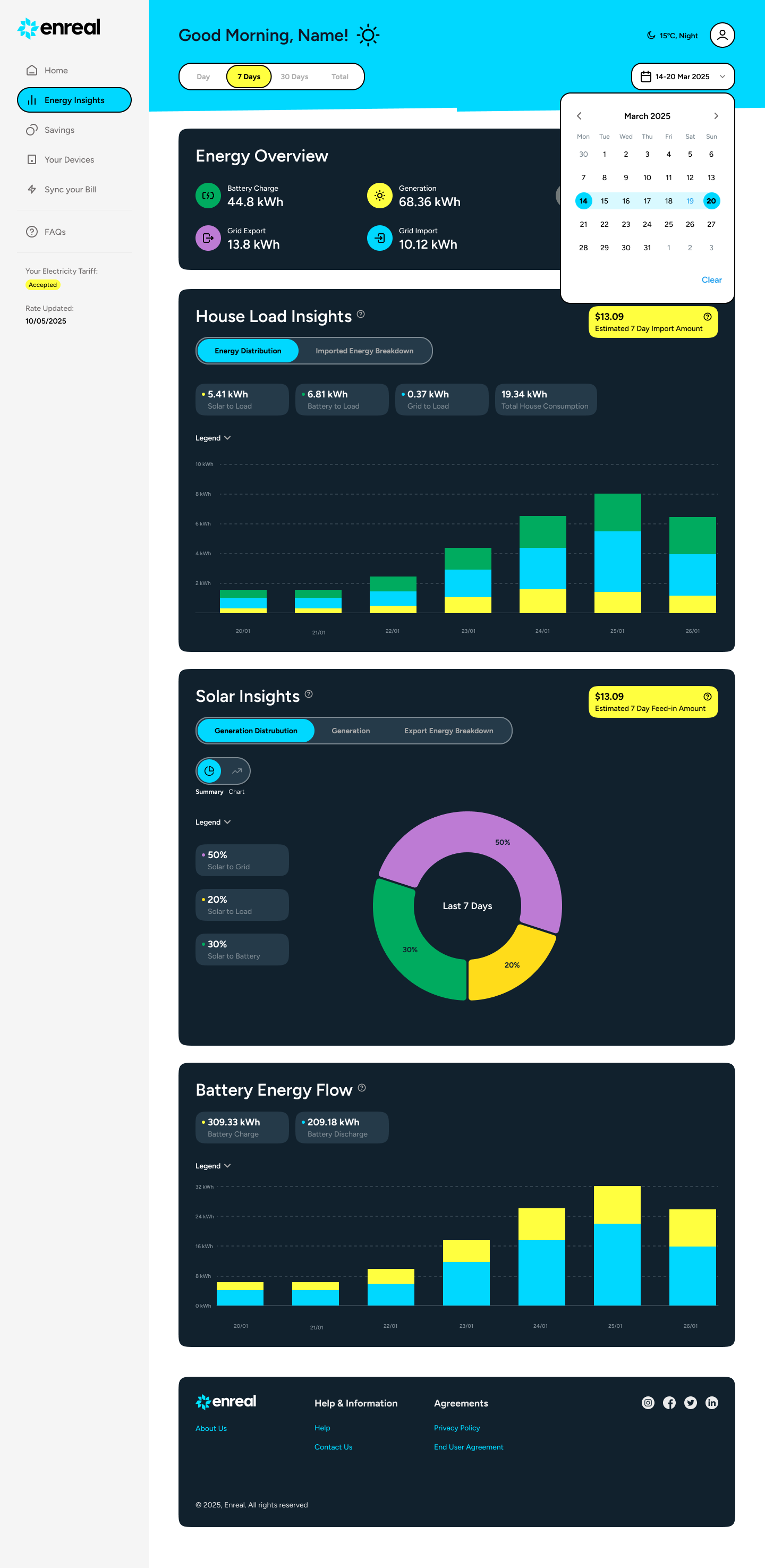
The web portal was designed for the same users as the app, but in a desktop context where more screen real estate and a longer session changes how energy data should be presented. The dashboard surfaces historical charts, seven-day energy views, and detailed breakdowns — content that exists on mobile but is significantly more useful when a user can see it at full width across multiple panels simultaneously.
The telemetry charts in the portal are intentionally more detailed than the mobile equivalents. Desktop users who choose to open the portal are signalling a different intent to someone doing a quick home screen check. The interface reflects that. The portal launched alongside the mobile app, giving users access to both from day one.
Zelora and Enreal launched on iOS and Android with the web portal available at the same time. The underlying design system — components, tokens, layout logic — was structured to be extended, and the team continued shipping new features on top of the same foundations after the initial release. The white-label architecture held up across both brands without diverging into separate codebases or design files.